
 Number of pupils in the sample    40
 Mean for X is         106.95     Mean for Y is          39.62
 Standard dev. for X is 12.37     Standard dev. for Y is  6.29

 Covariance is                     44.08
 Coefficient of correlation is      0.57
 Coefficient of determination is   32.09%
 Standard error of estimation is    5.18
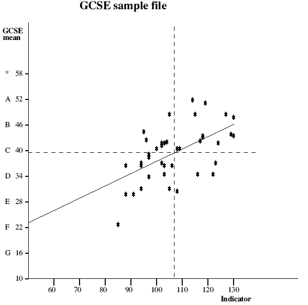
This graph plots the indicator score along the x axis and the examination score along the y axis. Individual pupil performances are shown as asterisks and the line of best fit (regression line) plotted between them giving a visual representation of the correlation between the two variables.
This time Pearson's Product Moment correlation method is used to calculate the correlation co-efficient and may produce a slightly different value to that arrived at using Spearman's formula, the latter being distorted if too many scores are tied.
The vertical dotted line shows the average indicator score (in this case the Edinburgh Reading Test but it could be any valid test) and the horizontal dotted line shows the average examination performance. These are useful in that it is immediately obvious that all those plots in the top right quadrant were better than average in both their indicator score and their examination results. Those plots in the bottom left quadrant were worse than average in both respects. Those plots in the bottom right quadrant had higher than average indicator scores but worse than average examination results, whereas those plots in the top left quadrant had worse than average indicator scores but better than average examination results.
The co-efficient of correlation is also shown as are standard deviation figures for the values on the x and y axes. These latter figures give some idea of the spread of their respective values and the covariance gives a measure of the shared variation in the two variables; the larger this figure is the more linear the appearance of the scattergraph.
The coefficient of determination shows statistically how much of the variation in outcome could be attributed to the variation in input.
The standard error of estimation gives the error margin to be taken account of in any estimate of likely outcome based upon a given indicator score.
Things to consider
By entering a value for the indicator score it is possible to read off the diagonal line what the equivalent examination result would be. For instance, by using past performance as an indicator for the future and given that you would know a year group's indicator score before their results it would be possible to feed this in and see what you might expect them to achieve. Similarly one might feed in an individual's indicator score and see if what s/he actually achieved was better or worse than the average for someone of that ability as indicated by the regression line.
Be aware that the line of best fit may seem somewhat skewed because several pupils may be plotted on exactly the same point therefore making it seem that there were far fewer plots on one side of the line than the other.
By squaring the co-efficient of correlation and multiplying by 100 it is possible to produce a figure showing the percentage of variance in one variable that can be attributed to its linear relationship with the other variable.
An interesting exercise is to produce a graph from the combined results of a number of years, finding an average indicator score and the examination mean. One could then enter in the actual average indicator score for a particular year and see if that year's average examination result was higher or lower than the average shown by the regression line.
In using a consortium approach to this analysis one is able to compare one's own school graph with that produced by pupils using the same indicator but in all schools.
In this way one can gain a measure of the school's examination performance, value added or not as the case may be. Of course there are other factors to take into account but at least one would have an indicator that takes account of the potential differences in ability of students in different schools.
For more information about this site, Tel. 01963 34128 or E-mail: info@bstubbs.co.uk
SPA Home page
Further GCSE analyses
A-level analyses